< Back to other topics
< Back to other topics
The "wind rose": The actual wind's graphical display
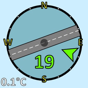
The "wind rose" is always visible at the data monitor page of a Holfuy weather station which has a wind sensor. It is showing the actual wind conditions in a graphical form.
-
In the circle you can see the average wind speed's value with a number. Its color is in function of the wind speed.
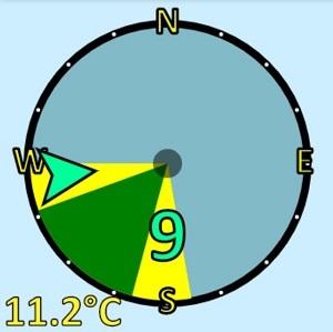
- The actual wind direction is visualized with an arrow near the border of the circle. Its color is in function of the wind speed.
- The air temperature's value is visible at the bottom left corner. Its color is in function of the temperature.
- For applications where the wind direction is important, optionally the station owners can define the following direction zones as slices in the circle.
-
Green Zone: optimal wind directions. E.g. for a paragliding/hang gliding launch it means wind directions, when the wind is blowing on the slope, in which it is possible to stay up with a para-/hang glider by soaring when the wind strength is enough.
For wind and kitesurfing spots it can show on-shore wind conditions. -
Yellow Zone: acceptable wind directions. When the wind direction is not optimal for the site/place, but it can be still good. For example wind directions in which it is possible to launch with a paraglider.
Near water it can show sideshore winds. -
For airfields it is not possible to show directions zones in the wind rose, but it is possible to add one (or two) runway drawing to the wind rose.
-
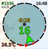
In the map view and in some widgets there are red dots at the outer circle of the wind rose. These dots are showing the last 5 wind direction readings (the smallest dot represents the oldest reading, the biggest the latest).
< Back to other topics